It is eminent that colors can instantly affect our moods since they can stimulate an array of emotions. For instance, warm colors like red, yellow, and orange can trigger different feelings, from coziness and warmth to antagonism and anger. Similarly, cool colors like green, blue, and purple can evoke sentiments of serenity and melancholy.
In this article, we will write about soft and soothing colors, pastel colors, and how they can add magic to your web design, graphic design, and artwork. So, let’s get started!
What Are Pastel Colors?
The softer variations of primary and secondary colors created by mixing white with the original hue are known as pastel colors, or “tints.” For instance, pale pink is a shade of red that contains some white and becomes paler and softer as you further add white color. The color you will get from this color blend will be mild but will still have its intensity because of its initial pure hue origin.
These soothing and unobtrusive colors are often used in designs to convey a sense of calmness and relaxation. They have maintained lasting popularity in graphic design due to their subtle, eye-catching appearance.

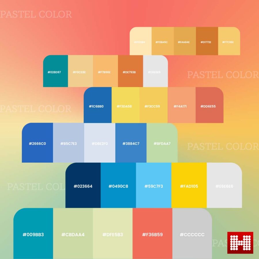
Some Pastel Colors With Hex Codes

Pastel Color Palette: A pastel color palette blends two or more complementary pastel hues to give your design a harmonious look.
The Psychological Impact of Pastel Colors
The color of an object or a design is probably what initially grabs your attention and shapes your view of it. Since colors significantly impact human behavior, businesses can enjoy a significant advantage when developing images for their marketing efforts because they can influence how people perceive things. That means you don’t have to use incredibly brilliant colors to convey your message because pastels also have a distinctive way of connecting with people’s emotions.
You can take advantage of their contrast and explore the wide range of pastel design options. Understanding which colors to employ in your visual material based on the audience you are trying to reach is a crucial first step. That’s because while pastel hues may help certain people communicate more effectively, they may be perceived as meaningless by others who find them cold and shallow.
Let’s see how pastel colors can affect psychology.
1.Pleasant Effect
Because they are less intense than the original colors, pastel colors have a more relaxing effect. We know that people universally use colors like pastel pink, baby blue pastel, and pale yellow in children’s rooms. These colors have great potential in graphic design as well. Since they provide a sense of peace, cleanliness, and white space, they can enable your audience to interact with your creatives and comprehend your message when used appropriately in your artworks.
2.Uplifting Vibes
Due to their calming effect, pastel colors can improve someone’s mood just by looking at a design with a pastel color scheme. A well-planned pastel image can inspire hope in its viewer because they serve as a constant reminder of pleasing sensations.
3.Elegant and Charming
Pastel hue tones can exude elegance and hold a sophisticated vibe wherever you use them—in fashion, on your website, or while producing your designs. Putting things in the appropriate context is the only requirement.
4.Refreshing
Pastel colors are often associated with spring, vacation, or new beginnings. Holidays paired with pastels emerged as a fresh social trend in the middle class of Europe during the Victorian era. On the beach, people forgot all about the dark colors associated with winter and embraced the soft colors of their umbrellas and clothing.
Tips For Using Pastel colors in Designs
You can utilize pastel hues in large quantities without worrying about overpowering your audience because of their muted appearance. However, you should remember a few recommended practices when creating your pastel-based designs.
1.Choose brand-consistent hues
The ideal course of action is to select pastel colors for your upcoming designs if the aesthetics of your business already incorporate those hues. This way, people will associate your brand more quickly with all the creatives you produce and present to your audience.
However, if you are starting a new business, then the case is different. To ensure the design has the best effect on your audience, you must consider the values of your brand and the hues that best convey your business’s character.
2.Utilize more than one pastel colors
While using just one pastel color is fine, it works best when paired with others. Due to its desaturation, it may not have the impact you wanted when applied alone.
Since you can’t go wrong when combining these calming colors, attempt to utilize more than one pastel if you want to base your entire design purely on soft hues. Use dark pastel colors with their light pastel counterparts as an alternative if you don’t want to combine two different tones.
3.Try a combination of pastel and accent colors
You may use only pastels or combine them with accent colors to give your designs a more vibrant look. Darker, more vivid colors work incredibly well when combined with pastels and provide a highly balanced result, with just the appropriate amount of attention on specific components or areas. By using contrasting colors, you can draw attention to a particular part of your design and increase viewer interest.
4.Combine soft metallics with your pastels
When it comes to color combinations, pastel hues are incredibly versatile, especially if you pay attention to which colors work well together. You can use subtle metallic colors to highlight various features in your images to give them a more upscale appearance. This color combination works incredibly well when creating your business cards or invites, giving them a sophisticated yet contemporary appeal.
5.Select a complementary color scheme
If you want to incorporate more than one pastel color into your design but aren’t sure which one, choose a complementary pair of hues. When you have a color scheme as the basis for your artwork, it is simpler to add accent colors and experiment with many versions of your visuals until you find the ideal combination.
6.Test various versions of pastel designs
You can select from a plethora of different pastel color schemes. They provide an excellent chance to experiment with various pastel colors to determine which ones your visuals respond to the most.
Wrapping Up!
Due to their versatility and refreshing and charming effect, pastel colors work wonders when used appropriately in web and graphic designs. Their adaptability allows their usage in countless different ways. Profit from their potential psychological impact by transforming your advertisements into visually appealing pieces that can instantly captivate your viewers.
Hashe is one of the leading IT and digital marketing agencies that provide exceptional web and graphic designing services. Contact us today for world-class IT and creative solutions!
Keep following us for more tech news! Check out our Social Media Pages
Was this helpful?
Last Modified: January 31, 2025 at 10:13 am
773 views


